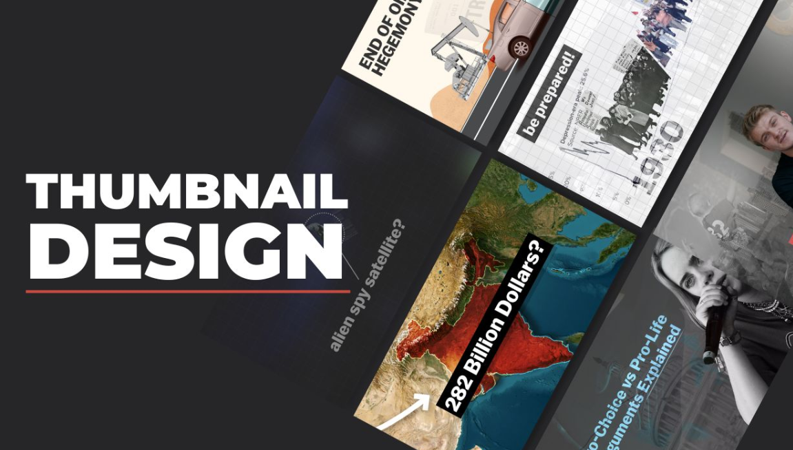
Creating a documentary takes time, research, and storytelling skill. But even the most powerful documentary can go unnoticed if people don’t click on it. That’s where thumbnails come in. A thumbnail is the small preview image viewers see before clicking a video. It acts like a movie poster, giving people a quick idea of what the video is about.
For documentary creators on platforms like YouTube, Vimeo, and streaming sites, a thumbnail is often the first thing viewers notice. If it’s boring or confusing, people may scroll past your video—even if the content is excellent.
This guide explains how to design thumbnails for documentary videos step by step. You’ll learn about visual storytelling, design strategies, color choices, text placement, and tools that help create professional thumbnails that attract viewers.
Why Documentary Thumbnails Matter More Than You Think
Many creators underestimate the power of thumbnails. But research shows thumbnails strongly influence whether viewers click a video.
A well-designed documentary thumbnail can:
-
Increase click-through rate (CTR)
-
Build curiosity and emotional connection
-
Communicate the topic instantly
-
Strengthen your brand identity
-
Help your video stand out among competitors
Think of thumbnails as visual headlines. Just like a newspaper headline convinces readers to open a story, your thumbnail convinces viewers to click your documentary.
What Makes a Documentary Thumbnail Different from Other Videos
Documentary thumbnails are different from gaming or vlog thumbnails. They usually focus on story, truth, emotion, and real-world events rather than exaggerated reactions.
Here’s a quick comparison:
| Video Type | Typical Thumbnail Style | Goal |
|---|---|---|
| Gaming | Bright colors, animated characters | Excitement |
| Vlogs | Facial expressions, bold text | Personality |
| Tutorials | Clear topic text | Education |
| Documentaries | Real images, dramatic visuals | Curiosity & storytelling |
Documentary thumbnails often use real photographs, historical images, or cinematic frames to reflect authenticity.
The Story Should Begin in the Thumbnail
A strong documentary thumbnail tells a mini story in one image.
Instead of simply showing a random scene, try to capture the central conflict or theme of your documentary.
Example
If your documentary is about ocean pollution:
❌ Weak Thumbnail
Just a picture of the ocean.
✅ Strong Thumbnail
A turtle trapped in plastic waste with the text:
“The Ocean’s Silent Crisis”
The second option tells a story instantly.
Essential Elements of a High-Performing Documentary Thumbnail
A great thumbnail usually contains several key elements working together.
1. A Powerful Image
The image is the most important part. It should be:
-
Clear
-
Emotionally engaging
-
Relevant to the topic
-
High resolution
Good documentary image ideas include:
-
Historical photos
-
Close-ups of people
-
Environmental scenes
-
Dramatic landscapes
-
Real-world events
Images that evoke emotion or mystery perform better.
2. Focus on One Main Subject
Many beginners add too many elements to thumbnails. This makes them confusing.
Instead:
-
Choose one main subject
-
Make it the visual focus
-
Remove distractions
For example:
| Bad Design | Better Design |
|---|---|
| 6 small photos in one image | One powerful photo |
| Lots of small text | One bold phrase |
| Busy background | Clean composition |
Simplicity helps viewers understand the thumbnail instantly.
3. Use Emotion to Create Curiosity
Emotion plays a huge role in documentary storytelling.
Thumbnails that trigger feelings tend to perform better.
Common emotional triggers include:
-
Shock
-
Curiosity
-
Sadness
-
Inspiration
-
Mystery
-
Urgency
Example emotional themes:
| Documentary Topic | Emotional Angle |
|---|---|
| Climate change | Fear for the future |
| Wildlife protection | Sympathy for animals |
| History documentaries | Curiosity about the past |
| Crime documentaries | Suspense and mystery |
Your thumbnail should hint at the emotion viewers will experience in the documentary.
Choosing the Right Colors for Documentary Thumbnails
Color plays a big role in grabbing attention.
Colors That Work Well
| Color | Psychological Effect | Best Use |
|---|---|---|
| Red | Urgency, danger | Conflict topics |
| Blue | Trust, seriousness | Science or history |
| Yellow | Attention-grabbing | Titles or highlights |
| Green | Nature and environment | Wildlife documentaries |
| Black | Mystery and drama | Crime or dark topics |
Color Contrast Tips
High contrast improves visibility on small screens.
Examples:
-
White text on dark background
-
Yellow text on black
-
Red elements on blue backgrounds
Low contrast makes thumbnails difficult to read.
Writing Text That Makes People Click
Text is optional, but it can improve thumbnails when used correctly.
Keep Text Short
Good thumbnails usually use 2–5 words only.
Examples:
-
“Hidden History”
-
“Ocean Crisis”
-
“The Lost Tribe”
-
“Secrets of the Pyramid”
Avoid long sentences.
Use Large Bold Fonts
Viewers often see thumbnails on phones, so text must be readable at small sizes.
Good font practices:
-
Bold fonts
-
Simple lettering
-
Strong contrast with background
-
Avoid script or decorative fonts
Composition Tricks Used by Professional Designers
Designers use certain layout strategies to guide viewers’ eyes.
The Rule of Thirds
Divide your thumbnail into 9 equal sections.
Place the main subject along the lines or intersections.
This creates a balanced and visually pleasing design.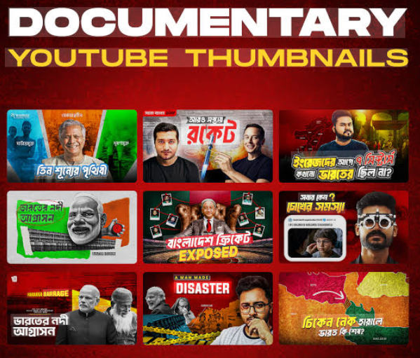
Directional Focus
Use elements that point toward the main subject.
Examples:
-
A person looking at something
-
Arrows or lines
-
Light beams
-
Motion direction
This naturally guides the viewer’s eye.
Foreground vs Background
Separating elements creates depth.
Example layout:
Foreground: Person
Background: Location or scene
Text: Top or side
This cinematic look works well for documentaries.
Thumbnail Styles That Work Best for Documentary Videos
Different documentaries benefit from different styles.
1. Cinematic Frame Style
This style uses a frame taken directly from the documentary.
Best for:
-
Nature films
-
Travel documentaries
-
Historical stories
Benefits:
-
Authentic
-
High-quality visuals
-
Story-focused
2. Before-and-After Style
Great for investigative documentaries.
Example topics:
-
Environmental destruction
-
Urban development
-
Climate change
Example layout:
| Left Side | Right Side |
|---|---|
| Healthy forest | Deforested land |
This creates instant curiosity.
3. Character-Centered Style
A close-up of a person involved in the story.
Works well for:
-
Human rights documentaries
-
Biographies
-
Social issues
Faces connect emotionally with viewers.
4. Mystery Silhouette Style
A shadowed figure or hidden subject.
Common in:
-
Crime documentaries
-
Secret history
-
Conspiracy topics
This style builds suspense.
Tools for Designing Documentary Thumbnails
You don’t need expensive software to design great thumbnails.
Here are some popular tools.
| Tool | Skill Level | Best For |
|---|---|---|
| Canva | Beginner | Quick designs |
| Photoshop | Advanced | Professional editing |
| Figma | Intermediate | Layout design |
| Pixlr | Beginner | Simple edits |
| Snappa | Beginner | Fast thumbnails |
For beginners, Canva is often the easiest option.
Step-by-Step Thumbnail Design Process
Here’s a simple workflow many creators follow.
Step 1: Identify the Core Idea
Ask yourself:
-
What is the main story?
-
What emotion should viewers feel?
-
What moment represents the documentary?
Step 2: Choose a Powerful Image
Pick a photo that represents the topic clearly.
Make sure it:
-
Is high resolution
-
Has a clear subject
-
Is visually dramatic
Step 3: Remove Distractions
Crop unnecessary elements.
Focus attention on the main subject.
Step 4: Add Text (Optional)
Add a short phrase that increases curiosity.
Examples:
-
“The Hidden Truth”
-
“Inside the Disaster”
-
“What Really Happened?”
Step 5: Adjust Colors and Contrast
Enhance brightness, shadows, and contrast to make the thumbnail pop.
Step 6: Test at Small Size
Zoom out to thumbnail size.
Ask:
-
Can I understand it instantly?
-
Is the text readable?
If not, simplify.
Thumbnail Size and Technical Requirements
For platforms like YouTube, the recommended thumbnail size is:
| Specification | Value |
|---|---|
| Resolution | 1280 × 720 pixels |
| Aspect ratio | 16:9 |
| File format | JPG, PNG |
| Maximum size | 2 MB |
Always use high resolution so thumbnails look sharp on all devices.
Common Thumbnail Mistakes Documentary Creators Make
Avoid these frequent errors.
1. Too Much Text
Long text reduces clarity.
Bad example:
“Everything You Need To Know About Climate Change”
Better:
“Climate Truth”
2. Overcrowded Design
Too many images confuse viewers.
Simplify the layout.
3. Misleading Clickbait
Clickbait may increase clicks but damages trust.
Documentary audiences value credibility and authenticity.
4. Low Quality Images
Blurry images make thumbnails look unprofessional.
Always use high-resolution photos.
How Successful Documentary Channels Design Thumbnails
Top documentary creators follow certain patterns.
Common strategies include:
-
High contrast colors
-
Dramatic photography
-
Minimal text
-
Emotional imagery
-
Consistent style
Consistency helps viewers recognize your channel quickly.
Creating a Thumbnail Style Guide for Your Channel
If you plan to produce many documentaries, create a consistent style.
A style guide may include:
-
Primary colors
-
Font choice
-
Text placement
-
Logo position
-
Image tone
Example style template:
| Element | Example |
|---|---|
| Primary color | Dark blue |
| Text color | White |
| Font | Bold sans-serif |
| Text position | Bottom third |
| Image style | Cinematic photography |
Consistency builds a recognizable brand.
A Simple Thumbnail Design Blueprint
Here is a basic layout many documentary creators use.
Key features:
-
One clear subject
-
Strong background
-
Minimal text
Testing and Improving Your Thumbnails
Even experienced creators test thumbnails.
Ways to improve performance:
-
Compare click-through rates
-
A/B test different thumbnails
-
Analyze audience behavior
-
Track which styles perform best
Over time, you’ll discover what works for your audience.
Quick Checklist Before Publishing a Thumbnail
Before uploading your documentary, check these points.
✔ Clear subject
✔ High resolution image
✔ Readable text
✔ Strong contrast
✔ Emotional impact
✔ Simple composition
✔ Accurate representation of the video
If the answer is yes to all, your thumbnail is likely effective.
Final Thoughts
Designing thumbnails for documentary videos is both an art and a strategy. A strong thumbnail doesn’t just look attractive—it tells a story, sparks curiosity, and invites viewers into the world of your documentary.
By focusing on powerful imagery, emotional storytelling, simple design, and clear text, you can dramatically increase the chances that people click on your video.
Remember, viewers often decide within seconds whether to watch a video. Your thumbnail is the first impression. Treat it like a movie poster for your documentary—carefully crafted to communicate the story and capture attention instantly.
As you create more documentaries, continue experimenting with different thumbnail styles, colors, and layouts. Over time, you’ll develop a visual style that not only attracts viewers but also strengthens your brand as a documentary creator.
A well-designed thumbnail can turn an overlooked video into a widely watched documentary. So invest time in your thumbnails—the success of your storytelling may depend on it.
