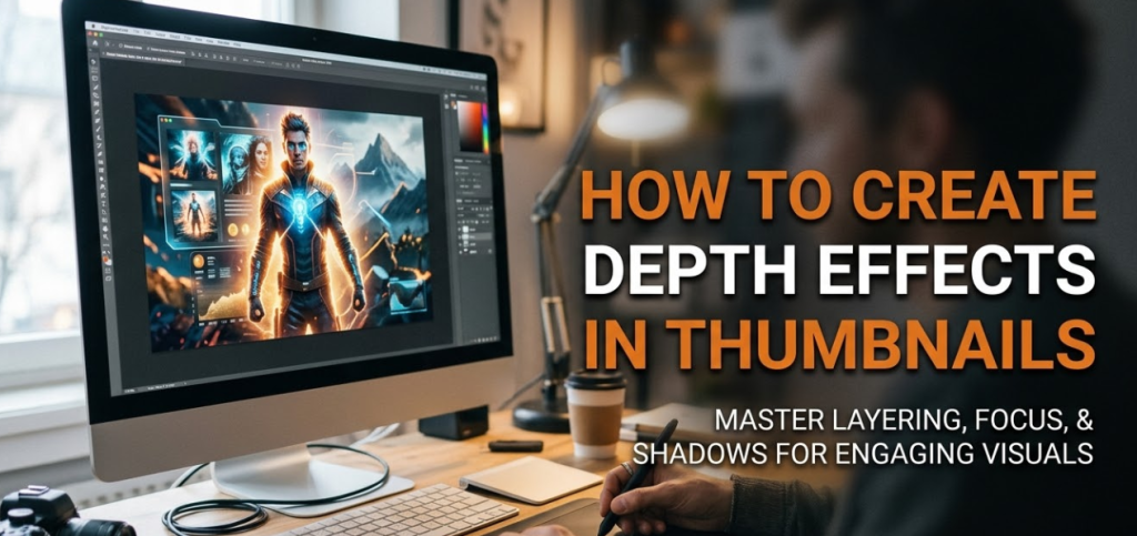
If you've ever scrolled through YouTube and stopped on a thumbnail that just popped, you've already felt the power of depth effects in thumbnails. That feeling — where something looks 3D or like it's jumping out of the screen — doesn't happen by accident. It's a design choice, and it's something anyone can learn.
Flat thumbnails blend in. They get ignored. But thumbnails with depth pull the eye in. They feel alive. They make people curious.
The good news? You don't need to be a professional designer or use expensive software to create this effect. Whether you're a YouTuber, a student making a class project, or a content creator just starting out, this guide will walk you through everything — step by step, in plain language.
By the end, you'll know exactly how to make your thumbnails feel deep, layered, and impossible to scroll past.
What "Depth" Actually Means in a Thumbnail
Before jumping into techniques, let's get one thing clear: depth in design is an illusion.
Your thumbnail is a flat image. It has no actual 3D space. But your brain reads certain visual cues as depth — just like how a painting of a road disappearing into the horizon looks far away, even though it's just paint on a flat canvas.
Designers use these visual tricks to fool the eye into seeing layers, distance, and dimension.
The Science Behind Why Our Eyes See Depth
Your eyes are constantly looking for clues about space. In the real world, things that are far away look smaller. Things that are close look bigger and more detailed. Colors look faded in the distance. Shadows tell you where light is coming from.
When you add these same clues to a flat image, the brain automatically interprets them as depth. It's not magic — it's just how human vision works.
This is why depth effects in thumbnails are so powerful. They tap into something instinctive.
The Core Depth Techniques Every Thumbnail Creator Should Know
There are several key methods used to create depth in thumbnails. Each one works on its own, but combining them makes the effect even stronger.
1. Layering: Front, Middle, and Back
Think of your thumbnail like a stage play. There's the front of the stage (foreground), the middle of the stage, and the back wall (background). When you place different elements at these three levels, your image instantly gains depth.
How to do it:
- Put your main subject (a face, object, or text) in the foreground.
- Add a supporting element or scene in the middle ground.
- Use a blurred or simple background behind everything.
Even just having two layers — a subject in front and a background behind — makes a massive difference compared to placing everything on the same flat level.
2. Blur (Depth of Field Effect)
This is one of the most popular and effective depth tricks. You've seen it in professional photos — the subject is sharp and clear, but the background is soft and blurry.
This is called depth of field, and it mimics how camera lenses work in real life.
How to apply it:
- Keep your main subject sharp and detailed.
- Blur the background using any editing tool (Photoshop, Canva, even mobile apps).
- Optionally, add a very slight blur to foreground elements that are "too close to the camera."
The stronger the blur contrast between foreground and background, the more dramatic the depth feels.
3. Size and Scale
In real life, bigger = closer. If you place a large element on one side of your thumbnail and a small version of the same element far away, the brain reads it as distance.
This technique is called size scaling, and it's incredibly simple to use.
Quick example: Imagine a thumbnail showing two people. One person is large and close on the left. The other is tiny and far away on the right. Instantly, your brain sees a scene with real space in it.
4. Overlapping Elements
When one object overlaps another, your eye reads the object on top as being closer. This is one of the oldest tricks in visual art, and it still works perfectly in thumbnail design.
Try this:
- Let your subject slightly overlap the text box or title.
- Have a character's arm or head extend in front of a background shape.
- Use a logo or icon that sits in front of other design elements.
Overlapping creates a clear hierarchy of "what's in front" and "what's behind."
Using Light and Shadow to Add Dimension
Light is one of the most powerful tools in a designer's kit. Without light, everything looks flat and fake. With good lighting, even a simple thumbnail can look cinematic.
How to Use Drop Shadows
A drop shadow is a soft, dark copy of an element placed slightly behind it. When you add a drop shadow to your subject or text, it lifts them off the background.
Settings to try:
- Distance: 5–15 pixels (not too far, or it looks cartoonish)
- Blur: medium softness
- Opacity: 30–60%
- Color: dark grey or the complementary color to your background
Avoid jet-black shadows unless you're going for a graphic novel look. Soft, colored shadows look more natural.
Inner Shadows and Highlights
Beyond drop shadows, you can add highlights (bright edges) to make elements look rounded or lit from a specific direction.
- Add a light glow to the top-left edge of your subject to suggest a light source from above.
- Add a darker tone to the bottom-right to create a sense of volume.
This gives flat cutout images a 3D, almost sculpted appearance.
Consistent Light Direction
Here's a pro tip most beginners miss: all your light sources should come from the same direction.
If your subject has light hitting from the left, but your background has light from the right, the image feels "off" — even if the viewer can't explain why. Keeping a consistent light direction ties everything together and makes the depth feel believable.
Color Techniques That Create Instant Depth
Color is another powerful cue for depth. Used right, it can make your thumbnail feel like it has miles of space in it.
Warm Colors Come Forward, Cool Colors Recede
This is color psychology at work. Warm colors — reds, oranges, yellows — naturally feel closer to the viewer. Cool colors — blues, purples, greens — feel farther away.
How to use this:
- Use warm tones on your foreground subject.
- Use cool or muted tones for your background.
This alone can push your subject forward and push the background back, without any blur at all.
Atmospheric Haze (Color Fading in the Distance)
In nature, distant mountains look slightly blue and hazy. This happens because of air and light particles in the atmosphere. Designers use this trick in thumbnails by slightly tinting distant background elements with a cool, faded tone.
To recreate this:
- Add a very subtle blue or light grey overlay to your background layer.
- Reduce the saturation of background colors slightly.
- Make background elements slightly brighter and less detailed.
The contrast between the sharp, saturated foreground and the hazy background makes the depth feel almost three-dimensional.
Color Contrast and Focus
High contrast draws the eye forward. Low contrast pushes things back.
Your subject should have strong contrast — dark against light, or bright colors against a muted background. This automatically makes it feel like it's at the front of the image.
Text Placement and Depth
Text is often an afterthought in thumbnail design — but placing text with depth in mind can completely change how your thumbnail reads.
Put Text Behind or In Front of Objects
One of the easiest ways to add depth to your thumbnail text is to play with its position in the layering order.
Option 1 — Text in front: Your title floats over the subject and background. Add a drop shadow to the text to separate it from everything else.
Option 2 — Subject in front of text: This is the more advanced version. You place the text as a background layer and have your subject partially overlap it. This gives the strong impression that the subject is "coming out" of the image.
For example: the text "10 CRAZY FACTS" sits in the background, and a face or character is placed slightly in front of it. The overlap tells the brain the subject is in front of the text — which is in front of the background. Three layers, massive depth.
Text with Perspective
Another technique is giving your text a 3D perspective — tilting it slightly as if it's receding into the background or coming toward the viewer.
Most design tools have a "3D" or "perspective" option for text. Use it carefully — a slight tilt is effective, but too much looks cluttered.
Tools You Can Use to Create Depth Effects in Thumbnails
You don't need Photoshop to pull off great depth effects. Here's a breakdown of the best tools at different skill levels:
| Tool | Skill Level | Best For | Price |
|---|---|---|---|
| Adobe Photoshop | Advanced | Full control over every effect | Paid |
| Adobe Express | Beginner | Quick depth effects and cutouts | Free/Paid |
| Canva | Beginner–Intermediate | Layering, shadows, blur effects | Free/Paid |
| Canvix | Beginner–Intermediate | Thumbnail-specific design with depth tools | Free/Paid |
| GIMP | Intermediate | Free Photoshop alternative | Free |
| Pixlr | Beginner | Browser-based quick editing | Free/Paid |
| Figma | Intermediate | Precise layering and effects | Free/Paid |
Each of these tools can handle the core depth techniques covered in this guide. Start with whatever you're comfortable with and level up from there.
Step-by-Step: Building a Depth-Effect Thumbnail from Scratch
Let's put it all together with a real workflow you can follow.
Step 1 — Start with a Clear Background
Pick or create a background that has some visual interest but isn't too busy. A gradient works great. A blurred outdoor scene works too. The key is that it shouldn't compete with your foreground.
Apply a subtle cool-toned overlay if you want atmospheric depth.
Step 2 — Add a Middle-Ground Element
This could be a shape, a secondary character, a logo, or a design element. Place it behind your main subject but in front of your background.
Slightly blur this layer — less than the background but more than the foreground.
Step 3 — Place Your Main Subject
Cut out your subject cleanly using a background removal tool. Place them clearly in the foreground.
Make sure they're sharp, well-lit, and high contrast compared to everything behind them.
Add a drop shadow under and behind them to lift them off the background.
Step 4 — Add Text with Purpose
Place your title text. If you want extra depth, tuck part of it behind your subject slightly. Add a drop shadow or a subtle glow to the text.
Keep the text color warm if your background is cool — this pushes the text forward even more.
Step 5 — Final Color and Contrast Pass
Step back and look at your thumbnail. Does the foreground feel clearly in front? Does the background feel far away?
If not:
- Increase the blur on the background.
- Boost the saturation on your foreground subject.
- Strengthen the drop shadows.
- Add a slight warm color grade to your subject.
When the depth feels obvious even at thumbnail size (around 1280x720 pixels, viewed small), you're done.
Common Mistakes That Flatten Your Thumbnails
Even experienced designers make these errors. Knowing them helps you avoid them.
Everything Is the Same Size
If your subject, background, and text are all roughly the same scale, the image looks flat. Use size variation intentionally — make your subject larger and more dominant.
No Shadows Anywhere
Shadows are the quickest way to add depth. If your thumbnail has zero shadows, every element looks pasted on rather than placed in a scene.
Too Many Competing Elements
When everything fights for attention, nothing reads as closer or farther — it just looks chaotic. Simplify. Three layers are enough for most thumbnails.
Inconsistent Lighting
As mentioned earlier, mixed light directions destroy believability. Always check that your shadows and highlights point in the same direction.
Low-Quality Subject Cutouts
If your subject cutout has messy edges, jagged lines, or a halo of the original background, the depth effect breaks down immediately. Take time to clean up your cutouts properly.
How Depth Effects in Thumbnails Impact Click-Through Rate
There's a direct connection between thumbnail depth and viewer behavior.
Studies on visual attention show that images with clear foreground-background separation hold the eye longer. When a thumbnail has strong depth, the viewer's brain processes it as more "real" — and real things are more interesting than flat designs.
According to research by Nielsen Norman Group, users engage more with images that feel natural and lifelike. Depth effects contribute directly to this perception.
Higher engagement with the thumbnail = higher click-through rate. Higher click-through rate = more views. It really is that simple.
Quick Reference: Depth Techniques at a Glance
| Technique | Effect Created | Difficulty |
|---|---|---|
| Layering (foreground/middle/back) | Clear spatial depth | Easy |
| Background blur (depth of field) | Subject pops forward | Easy |
| Size scaling | Sense of distance | Easy |
| Overlapping elements | Clear front-back order | Easy |
| Drop shadows | Lift elements off background | Easy–Medium |
| Warm vs. cool color split | Color-based depth | Medium |
| Atmospheric haze | Distance and space | Medium |
| Text layering (behind subject) | Dynamic 3D look | Medium |
| Perspective text | Motion and depth | Medium–Hard |
| Consistent light direction | Believable realism | Medium–Hard |
FAQs About Depth Effects in Thumbnails
Q1: Do I need Photoshop to create depth effects in thumbnails?
No. Tools like Canva, Canvix, and even free mobile apps can handle layering, blur, and shadow effects. Photoshop gives you more control, but it's not required to get great results.
Q2: What's the most effective depth technique for beginners?
Start with the background blur technique. Cut out your subject, place them over a blurred background, and add a simple drop shadow. This alone creates strong, believable depth and is easy to execute in almost any tool.
Q3: How do I remove the background from my thumbnail subject?
Most modern design tools have a one-click background removal feature. Canva, Adobe Express, and Remove.bg are popular options. For cleaner edges, Photoshop's Select Subject tool is the most precise.
Q4: Can depth effects help with YouTube SEO?
Technically, YouTube can't "read" your thumbnail the way it reads text. But better thumbnails improve your click-through rate (CTR), and YouTube's algorithm rewards videos with high CTR by promoting them more. So yes — indirectly, better depth effects can boost your search performance.
Q5: How many layers should a thumbnail have?
Three layers is the sweet spot for most thumbnails: background, middle ground, and foreground. You can add more, but three is usually enough to create strong depth without cluttering the design.
Q6: Should my text have a shadow too?
Yes, especially if your background is complex or colorful. A subtle drop shadow behind your text separates it from the background and makes it easier to read at small sizes.
Q7: Does depth work for all types of thumbnails?
Depth works across virtually all niches — gaming, education, lifestyle, tech, cooking, and more. The specific techniques you use might vary, but the core principle of creating visual layers applies to every type of content.
Bringing Your Thumbnails to Life
Flat thumbnails are forgettable. Thumbnails with depth are magnetic.
The techniques in this guide — layering, blur, scale, shadows, color contrast, and smart text placement — are all proven methods that professional designers use every single day. And the best part is that none of them require advanced skills or expensive tools.
Depth effects in thumbnails work because they mimic how we see the real world. When your thumbnail feels three-dimensional, it feels real. And real things catch attention far more than flat, lifeless designs.
Start small. Pick one technique from this guide and apply it to your next thumbnail. Then add another. Over time, these small choices stack up, and your thumbnails go from "just another image" to something people genuinely stop and look at.
Because in the world of online content, the thumbnail isn't just decoration. It's the first impression — and first impressions decide everything.
