Creating tutorial videos is one of the most effective ways to educate people online. Whether you teach cooking, programming, graphic design, gaming tips, or DIY projects, tutorials help viewers learn step-by-step. But there is one major challenge most creators face: getting people to click the video in the first place.
This is where video thumbnails become extremely important.
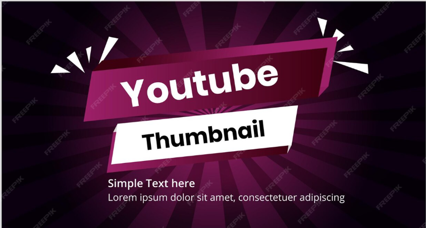
A thumbnail is the first visual impression viewers see before watching your tutorial. If it looks attractive, clear, and helpful, people are more likely to click. If it looks confusing or boring, they will simply scroll past your video.
In fact, studies from major video platforms show that thumbnails strongly influence click-through rate (CTR), which directly impacts views, engagement, and channel growth.
This detailed guide will teach you everything about creating the best thumbnails for tutorial videos — from design principles to colors, text placement, tools, and strategies that help your tutorials stand out.
Why Thumbnails Matter for Tutorial Videos
Tutorial videos are different from entertainment videos. Viewers usually search for a solution to a problem.
For example:
-
“How to edit photos on phone”
-
“Excel formulas for beginners”
-
“How to bake a chocolate cake”
-
“Fix slow computer in 5 minutes”
When viewers search for these topics, they often see dozens of videos with similar titles.
The thumbnail becomes the deciding factor.
A strong tutorial thumbnail helps by:
-
Increasing click-through rate (CTR)
-
Making the topic clear at a glance
-
Showing viewers what they will learn
-
Helping your video stand out in search results
-
Building a recognizable style for your channel
Quick Comparison
| Thumbnail Quality | Viewer Reaction | Result |
|---|---|---|
| Blurry image | Looks unprofessional | Few clicks |
| Too much text | Confusing | Viewers ignore |
| Clear visual + short text | Easy to understand | High clicks |
| Bright colors + clear topic | Eye catching | More views |
The Main Goal of a Tutorial Thumbnail
A good thumbnail should answer three quick questions in less than 2 seconds:
-
What is this tutorial about?
-
What result will I get after watching it?
-
Is this video worth my time?
If your thumbnail answers these questions visually, viewers will click.
Key Elements of a Perfect Tutorial Thumbnail
Let’s break down the most important parts that make a thumbnail successful.
1. Clear Subject Focus
Your thumbnail should show the main topic of the tutorial.
Examples:
| Tutorial Topic | Good Thumbnail Idea |
|---|---|
| Photoshop tutorial | Before and after image |
| Cooking recipe | Finished dish |
| Coding lesson | Code + result |
| Fitness tutorial | Exercise pose |
Avoid clutter. The viewer should understand the topic instantly.
2. Big and Readable Text
Text can make thumbnails clearer, but too much text is a mistake.
Good thumbnails usually use 2–5 words only.
Examples:
Good text ideas:
-
“Fix Slow PC”
-
“Excel in 10 Min”
-
“Perfect Cake”
-
“Photoshop Trick”
Bad text example:
“Complete Step by Step Tutorial to Learn Advanced Excel Formulas”
Too long = impossible to read on mobile.
Text Design Tips
-
Use bold fonts
-
Keep text large
-
Add shadow or outline
-
Use high contrast colors
3. Bright and Contrasting Colors
Color plays a huge role in attracting attention.
Bright thumbnails stand out among dozens of videos.
Popular Thumbnail Color Combinations
| Background | Text Color |
|---|---|
| Yellow | Black |
| Blue | White |
| Red | White |
| Black | Yellow |
| Purple | White |
Avoid colors that blend together like:
-
Grey on black
-
Yellow on white
-
Blue on purple
High contrast improves readability.
4. Visual “Before vs After”
This technique works extremely well for tutorials because viewers want results.
Examples:
| Tutorial | Thumbnail Idea |
|---|---|
| Photo editing | dull photo → vibrant photo |
| Cleaning tutorial | dirty surface → shiny surface |
| Fitness tutorial | beginner → strong posture |
| Graphic design | plain design → professional design |
The viewer instantly understands what they will learn.
5. Faces and Emotions (Optional but Powerful)
Human faces naturally attract attention.
If your tutorial includes you on camera, showing your face with a strong expression can improve clicks.
Examples:
-
Surprised face
-
Excited expression
-
Focused reaction
However, this works best for personal brands and YouTube creators.
Thumbnail Design Layouts That Work for Tutorials
Here are some layouts that perform well.
Layout 1: Split Screen
Used for comparison tutorials.
Examples:
-
Photo editing
-
Video editing
-
Graphic design
-
Cleaning tutorials
Layout 2: Problem → Solution
Example:
Slow laptop → Fast laptop
Layout 3: Big Object Focus
This layout works well when the tutorial focuses on one main tool or software.
Example:
-
Big Photoshop logo
-
Large Excel spreadsheet
-
Close-up of a cake
Layout 4: Minimalist Tutorial Thumbnail
Some of the best performing thumbnails are very simple.
Example structure:
-
Plain background
-
One main image
-
2–3 words
Minimalism helps the viewer understand quickly.
Ideal Thumbnail Size and Technical Settings
To ensure your thumbnail looks professional on all devices, follow these settings.
| Setting | Recommended Value |
|---|---|
| Size | 1280 × 720 pixels |
| Aspect Ratio | 16:9 |
| File Type | JPG or PNG |
| Maximum File Size | 2MB |
This size works best for most video platforms.
Thumbnail Text Ideas for Tutorial Videos
Here are examples of short powerful phrases often used in tutorial thumbnails.
| Topic | Text Ideas |
|---|---|
| Tech tutorials | Fix This Fast |
| Editing tutorials | Pro Edit Trick |
| Cooking tutorials | Perfect Recipe |
| Software tutorials | Easy Method |
| Study tutorials | Learn Fast |
Short phrases create curiosity and clarity.
Thumbnail Design Mistakes to Avoid
Many tutorial creators lose views because of simple mistakes.
1. Too Much Information
If viewers need to read for 5 seconds, the thumbnail has failed.
Keep it simple.
2. Cluttered Design
Avoid putting:
-
Too many icons
-
Too many screenshots
-
Too many colors
Clean designs perform better.
3. Low Quality Images
Blurry thumbnails instantly reduce trust.
Always use high resolution images.
4. Misleading Thumbnails
Clickbait may give temporary views but damages long-term growth.
If your thumbnail promises something the tutorial does not deliver, viewers will leave quickly.
This hurts your watch time and ranking.
Best Tools for Creating Tutorial Thumbnails
You do not need expensive software to design great thumbnails.
Here are popular tools used by creators.
| Tool | Best For |
|---|---|
| Canva | Beginner-friendly design |
| Photoshop | Advanced customization |
| Photopea | Free online Photoshop alternative |
| Figma | Clean design layouts |
| Snappa | Quick thumbnail templates |
For beginners, Canva is often the easiest option.
Step-by-Step Process to Create a Great Tutorial Thumbnail
Follow this simple workflow used by successful creators.
Step 1: Identify the Main Result
Ask yourself:
“What will viewers achieve after watching?”
Example: “Remove background from photos”.
Step 2: Show the Result Visually
Example:
-
Image with background
-
Image without background
Step 3: Add Short Text
Example:
“Remove Background”
Step 4: Use Bright Colors
Make sure text and images stand out.
Step 5: Test on Mobile
Most viewers watch videos on phones.
Zoom out and check if the thumbnail is still clear at small size.
Thumbnail Style Consistency for Channel Growth
Many successful tutorial channels use a consistent thumbnail style.
Benefits include:
-
Strong brand identity
-
Easy recognition
-
Professional appearance
Example consistency:
-
Same color scheme
-
Same text style
-
Same layout format
When viewers repeatedly see your style, they begin to recognize your channel instantly.
Psychological Tricks That Increase Clicks
Certain design elements trigger curiosity.
1. Arrows
Arrows guide the viewer’s eye to the important part.
Example:
Arrow pointing to a Photoshop tool.
2. Circles and Highlights
Circles highlight the key feature in tutorials.
Example:
Circle around a hidden menu or button.
3. Numbers
Numbers attract attention.
Examples:
-
“3 Editing Tricks”
-
“5 Excel Tips”
Numbers promise quick learning.
How Thumbnails Affect Video SEO
Thumbnails themselves are not a direct ranking factor, but they affect metrics that impact SEO.
These include:
| Metric | Why It Matters |
|---|---|
| Click-through rate | More clicks increase ranking |
| Watch time | Engaged viewers boost performance |
| Audience retention | Indicates tutorial quality |
Better thumbnails → more clicks → stronger SEO performance.
Thumbnail A/B Testing Strategy
Large creators often test multiple thumbnails.
This process helps identify the best design.
Basic testing method
-
Upload video with thumbnail A
-
Track CTR for 24–48 hours
-
Replace with thumbnail B
-
Compare performance
Choose the version with the higher CTR.
Examples of Effective Tutorial Thumbnail Concepts
Below are simple thumbnail ideas for different niches.
| Tutorial Type | Thumbnail Concept |
|---|---|
| Photo editing | Before / After image |
| Programming | Code + output |
| Cooking | Finished dish close-up |
| DIY craft | Materials → final product |
| Study tips | Student + notebook |
Visual storytelling increases curiosity.
Future Trends in Tutorial Thumbnails
Video platforms continue evolving, and thumbnail design trends change over time.
Emerging trends include:
-
Minimalist design
-
Bold typography
-
Color gradients
-
Clean backgrounds
-
Large central object focus
The goal remains the same: clear communication and visual impact.
Quick Checklist for the Perfect Tutorial Thumbnail
Before publishing your video, check these points.
✔ Clear topic
✔ High resolution image
✔ Short readable text
✔ Bright contrasting colors
✔ Simple layout
✔ Mobile-friendly
✔ Shows the final result
If all these boxes are checked, your thumbnail is ready.
Final Thoughts
Creating great tutorial videos is only half the battle. The other half is convincing viewers to click and start watching.
That’s where powerful thumbnails make a huge difference.
The best thumbnails for tutorial videos are:
-
Simple
-
Clear
-
Visually strong
-
Focused on the result
They quickly show viewers what they will learn and why the video is useful.
By using techniques like before-and-after visuals, bold text, bright colors, and clean layouts, you can dramatically increase your video’s click-through rate and reach a larger audience.
Remember, your thumbnail is essentially a visual advertisement for your tutorial. Spend time designing it well, and your videos will have a much better chance of getting the attention they deserve.
When you consistently combine great tutorials with compelling thumbnails, your channel can grow faster, attract loyal viewers, and build a strong reputation as a reliable learning resource.
