Picture this: You just uploaded a fresh video explaining fractions, photosynthesis, or the causes of World War II. It’s packed with clear examples, helpful animations, and simple explanations any middle-schooler or high-schooler can follow. But after a full day, only a handful of people have watched. What went wrong?
Nine times out of ten, the problem isn’t the lesson itself — it’s the tiny picture that shows up in search results and suggested videos. That picture is your thumbnail, and for educational channels, it acts like the cover of a textbook. If the cover looks boring or confusing, students scroll right past it, even if the video inside could change how they understand the subject.
The good news? You don’t need to be a professional designer or spend hours in fancy software. With the right ideas and a few easy tricks, anyone can create thumbnails that make students stop scrolling and hit play. This guide walks you through everything step by step: what works best for school subjects, which colors and words grab attention, free tools that do most of the work for you, and simple ways to test and improve over time. By the end, you’ll have everything you need to turn your educational videos into click magnets that help more kids learn.
Why Your Thumbnail Could Be the Make-or-Break Moment for Student Clicks
Students today watch YouTube on their phones more than anywhere else — about 70 percent of all views happen on mobile screens. They scroll fast, deciding in less than half a second whether your video looks worth their time. A strong thumbnail tells them instantly: “This will explain something tricky in a way that actually makes sense.”
Studies from top creators show that a well-designed thumbnail can boost click-through rates by 30 to 40 percent. That means if 100 people see your video in their feed, a great thumbnail might get 5 to 10 of them to click instead of just 2 or 3. For educational channels, those extra clicks add up fast. More views lead to more watch time, which tells YouTube’s algorithm your content is helpful, so it shows your videos to even more students.
Thumbnails also build trust. When kids see the same clean style across all your videos — like a favorite textbook series — they start recognizing your channel as reliable. They come back for more lessons because they know your thumbnails promise clear explanations without confusion or clickbait tricks. In short, a smart thumbnail doesn’t just get clicks; it turns one-time viewers into loyal subscribers who keep learning with you.
Core Ingredients for Thumbnails That Teach and Tempt
Every winning educational thumbnail shares a few simple building blocks. Keep these in mind and your designs will feel professional without feeling overwhelming.
Bright colors that pop but stay calm Use high-contrast colors so everything stays sharp on small phone screens. Blue and green work great for science and math because they feel trustworthy and relaxing. Yellow or orange accents add energy for history or language lessons. Avoid super dark backgrounds or tiny pastel colors — they disappear when students scroll quickly. Test your thumbnail by zooming it down to the size it appears in suggested videos; if you can still read the text and see the main idea, you’re golden.
Faces that show real emotions Putting a human face in your thumbnail can increase clicks by 25 to 30 percent. Students connect with a teacher who looks excited, thoughtful, or even a little surprised — it makes the lesson feel like a real person is helping them. For example, a photo of you pointing at a simple equation with a big smile says, “I’ve got this figured out, and you will too!” Just make sure the face takes up a good chunk of the space so it stays clear when the thumbnail shrinks.
Short text that answers “What’s in it for me?” Stick to three to five big, bold words max. Phrases like “5-Minute Trick,” “Easy Beginner Guide,” or “Before & After” tell students exactly how the video will help them. Use thick, easy-to-read fonts like Impact or Montserrat. Place the text at the top so YouTube’s play button or duration stamp doesn’t cover it up. Add a tiny drop shadow or white outline so the words stand out against any background.
One clear focal point Pick a single main idea — a highlighted formula, a simple diagram, or a big question mark — and make everything else fade into the background. Blurring the background slightly (a trick called “blur and pop”) keeps the thumbnail from looking messy. This “less is more” approach matches how good teachers explain things: one concept at a time.
Consistent branding across every video Use the same color scheme, font style, and layout for all your thumbnails. Think of it like a textbook series where every cover looks related. Students will spot your videos instantly in a crowded feed, and returning viewers will feel like they’re visiting a familiar classroom.
Here’s a quick comparison table to see the difference:
| Feature | Good Thumbnail Example | Bad Thumbnail Example | Why It Matters for Students |
|---|---|---|---|
| Color Contrast | Bright blue background with yellow text | Gray background with thin white text | Easy to read on phones; stops scrolling |
| Text Amount | “Fractions in 5 Minutes” | Long sentence with bullet points | Quick understanding in 0.3 seconds |
| Face Inclusion | Teacher smiling and pointing at board | No face, just slides | Builds trust and connection |
| Focal Point | One big equation highlighted | Multiple diagrams crammed together | Feels simple and not overwhelming |
| Branding | Same blue border on every video | Different styles for each topic | Makes your channel easy to recognize |
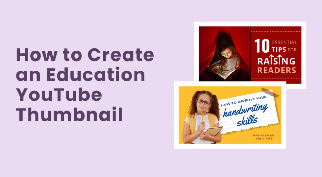
Tailor-Made Thumbnail Styles for Every School Subject
Different subjects need slightly different thumbnail vibes to match what students expect. Here are proven ideas that work especially well for educational channels:
Science and Biology Use green or blue backgrounds with simple icons like a microscope, leaf, or beaker. Show a before-and-after split — wilted plant on one side, healthy plant on the other — to promise transformation. Add text like “Photosynthesis Explained” with a curious face looking at the diagram. These thumbnails feel clean and trustworthy, perfect for experiments and explanations.
Math and Algebra Bright white or light blue backgrounds work best. Highlight one key formula or number in huge bold text. A common winner: your face looking surprised next to a problem like “Solve This in 60 Seconds?” Students love the challenge without feeling stressed. Keep diagrams super simple — one equation only.
History and Social Studies Warm orange or red accents give energy. Use old photos, maps, or timeline arrows as the main image. Text ideas: “What Really Caused WWII?” or “3 Facts You Never Knew.” A thoughtful or excited facial expression helps students feel the story is exciting, not just dates and names.
Language and Reading Soft yellow or purple backgrounds feel friendly. Show book covers, speech bubbles, or vocabulary words popping out. Great text: “Learn 10 New Words Today” or “Story Structure Made Easy.” Include a smiling face to make reading feel approachable and fun.
Test Prep and Study Tips High-energy colors like yellow with black text scream “quick help.” Use checkmarks, timers, or “A+” icons. Phrases like “Ace Your Next Test” or “Study Hack That Works” speak directly to students’ stress and goals.
For every subject, the rule stays the same: promise one clear benefit and keep it simple enough to understand at a glance.
Follow This Roadmap to Nail Your Thumbnail Design
Creating thumbnails doesn’t have to feel hard. Follow these exact steps every time:
- Watch your finished video and pick the best moment Pause at the spot where the main idea clicks. Take a clear screenshot. Good lighting and a plain background make editing easier.
- Open a free design tool (more on these below) Start with the official YouTube size: 1280 pixels wide by 720 pixels tall. This 16:9 shape looks perfect on phones, tablets, and computers.
- Add your main image or graphic Place the screenshot or simple drawing in the center. Blur the background slightly so the important part pops.
- Layer on big, bold text Keep it short and benefit-focused. Test the font size by shrinking the whole image — the words must still be readable.
- Include your face (optional but powerful) Crop a clear photo of yourself reacting to the topic and place it on one side. Add a small arrow or highlight box pointing to the key idea.
- Check contrast and mobile view Zoom out or view the thumbnail at tiny size. Make sure colors stand out and nothing gets blurry.
- Save as JPG or PNG under 2 MB Upload straight to YouTube Studio under your video’s details. You can change thumbnails anytime without losing views.
Repeat this process and you’ll finish each thumbnail in 10–15 minutes once you get the hang of it.
Easy Tools That Turn Beginners Into Thumbnail Experts
You don’t need expensive software. These free or low-cost options work great for educational creators:
- Canva — Super beginner-friendly with thousands of YouTube thumbnail templates. Drag-and-drop everything, plus built-in AI that suggests layouts. Free plan is enough for most channels; premium adds extra fonts and removes watermarks.
- Adobe Express — Quick and clean. Great for removing backgrounds or adding simple animations to icons. Free version handles everything you need for crisp educational designs.
- YouTube’s built-in editor — Upload a frame from your video and add basic text right inside YouTube Studio. Perfect for quick updates.
- Phone apps like PicsArt or Snapseed — Edit on the go. Great for teachers who film on their phones.
Pro tip: Create 2–3 template layouts in Canva (one for science, one for history, etc.) and just swap the text and photos each time. This keeps your branding consistent without starting from scratch every video.
Watch Out for These Thumbnail Traps That Scare Away Viewers
Even great teachers make these mistakes. Avoid them and your clicks will jump:
- Too much clutter — More than three elements confuses students. One idea per thumbnail wins every time.
- Tiny or thin text — If students can’t read it on their phone in half a second, they won’t click.
- Low contrast or dull colors — Gray or brown thumbnails blend into YouTube’s dark feed and get ignored.
- Misleading images — Showing something that doesn’t appear in the video might get an initial click but hurts your channel long-term because students leave quickly.
- Different style every time — Inconsistent thumbnails make your channel feel scattered instead of reliable.
- No face or emotion — Pure text or slide screenshots feel cold and less trustworthy than a real teacher’s expression.
Fix these and you’ll immediately stand out from other educational channels that still use plain default screenshots.
How the Biggest Educational Stars Crush Their Thumbnail Game
Look at channels millions of students already love:
Khan Academy keeps thumbnails super clean — big bold text, one simple diagram or icon, and often a calm teacher face. The design feels like a helpful worksheet, which matches their straightforward teaching style. Students know exactly what they’ll get: clear steps without fluff.
Crash Course uses energetic cartoon-style graphics and bright colors. Their thumbnails often show a character reacting strongly to the topic — surprise, excitement, or curiosity. The bold, fun look tells viewers the lesson will be fast-paced and entertaining while still teaching real facts.
TED-Ed goes for illustrated scenes with one dramatic moment. They use rich colors and short questions like “Can You Solve This Riddle?” The artistic style makes even tough topics feel like an adventure story.
These channels all follow the same rules you just learned: simple, emotional, consistent, and mobile-friendly. Copy their approach (without copying exact images) and your smaller channel can grow the same way.
Level Up Your Views: Smart Ways to Test and Tweak Thumbnails
The secret top creators don’t talk about enough? Testing. YouTube lets you upload up to three different thumbnails for the same video and automatically shows different ones to different viewers. After a day or two, check your analytics to see which version got the most clicks.
Change only one thing at a time — maybe the text, the color, or the facial expression — so you learn exactly what works. Run the test for at least a few hundred views or a couple of days. Many channels see their click-through rate climb from 3 percent to 6 or even 8 percent just by swapping a few thumbnails.
Refresh older videos every few months too. A new thumbnail on an evergreen lesson about algebra or photosynthesis can bring back hundreds of extra views without re-recording anything.
Ready to Transform Your Channel? Start Today!
Your educational videos already contain the knowledge students need. All that’s missing is a thumbnail that invites them in. By focusing on one clear idea, bright contrast, helpful text, and a friendly face, you create thumbnails that feel like a helpful teacher waving from the screen saying, “Come learn this with me — it’s easier than you think.”
Pick one upcoming video, open Canva, and try the step-by-step roadmap right now. Make two versions and test them. Within a week you’ll see more students clicking, watching longer, and coming back for your next lesson.
The best thumbnails for educational channels aren’t about fancy effects or perfect art. They’re about clarity, trust, and a promise that learning can be simple and fun. Start using these ideas today, stay consistent, and watch your channel grow while more kids actually learn from your hard work.
